Wednesday, 21 November 2012

The Final Piece!


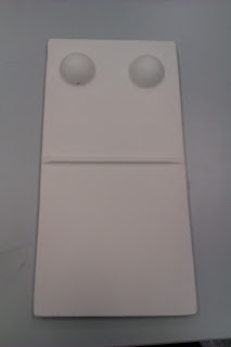
For the brief of ‘The Emperor’s New Clothes’, analysis of the story highlighted the aspect of social conformity to me which I began to focus on to direct my project. Conformity is evident throughout by the Emperors reliance on others opinions before forming his own, which I have chosen to represent through the combined use of dominoes and braille, creating a braille domino.
This was a conscious decision as I felt that a domino displays the effect of conformity by representing the impact that conformity has on us as a society by demonstrating the chain reaction that occurs when an individual yields to a majority influence. The name ‘Domino’ ultimately derives from the Latin dominus, meaning “lord” or “master.” Master has connotations of power and therefore portrays the informational conformity which is displayed within the short story as we look to people with power to gain answers. Dominoes also maintain an unvaried design as all in the set are indistinguishable; either black or having some common design, which relates to the lack of identity an individual can suffer when following the crowd. The aim and objectives of dominoes also further relates to the concept through blocking the opponent therefore obstructing individuality, and to create equal values which then relates to conforming to correspond with others.

The input of braille which spells ‘conform’ is an obscured instruction towards the viewer and fundamentally society, relating to the story where we seek answers from people who we believe to have more ‘power’ than us, therefore following what we believe to be the right thing. Braille is a tactile writing system used by the blind, and in this case, is combined to raise awareness of our failure to recognise the effects of conformity. The braille also conveys the attitude of conformity by spelling out this instruction in a less than conventional way, illustrating that society appears to be oblivious, just like the Emperor, to the effects of conformity and the way it is inflicted upon society by those with the power to do so.
In the case of reading conformity, we often look for alphabetical letters to read, but by replacing letters with braille, I am stimulating another sense of touch and therefore encouraging a different approach and reawakening the way we view things. Most individuals would not know what the braille reads, some may not know it is braille upon the dominoes at all, but once it is recognised, it can be read and then acknowledged, in the same way that it took the young boy to point out to the town that the suit never existed.
The whiteness that overwhelms the piece is representational of the loss of identity that comes as a result of conformity, by changing ourselves to fit in with others. Relevant research into the colour white states that it also conveys isolation and emptiness which expresses the feelings felt by someone who feels the pressure to conform, similar to the Emperor’s situation; they fear being an outcast therefore adapts to suit the company they are in. White is also an unspoiled colour, depicting a society overcome by conformity as everyone shares the same opinions and values with no real individuality existing and since white provides little stimulation towards our senses, this counteracts with the use of braille. Intuition in the sense of conformity is overruled when an ambiguous situation arises, therefore avoiding what we might already know just to follow the majority. The placement of the dominoes finally displays an unavoidable stance, as conformity is exposed for the viewer to interpret and recognise, again reinforcing the collective mentality that is created by conformity.


Mounting the Final Piece


After speaking to a lecturer as to how to go about mounting plaster, I have been informed to use an old fashioned drill which will slowly take away the plaster rather than undertaking the uncontrolled manner that a drill often has. I felt an experiment was required before committing to this idea so I used a previous failed experiment to create the holes on the back, experimenting with deep and shallow holes which a scew will then rest in and therefore, mount the piece onto the wall. Measurements were taken of the two deep holes on the back of my experiment to which I copied onto the wall and then drilled two scews into, while leaving enough of the scew out of the wall to catch onto the holes in the plaster. After this was done, I gradually pushed the braille domino onto the wall and thankfully, found that this method worked.


I measured the front of each individual braille domino to uncover where the holes would sit and then marked on the back where the holes would go. After this was completed I then marked up the individual measurements of the placement of each hole on the back of every braille domino and copied this onto the wall and marked where each screw needs to go in order to catch onto the plaster casts. Precision is required for this technique to ensure that the scews aren’t measured incorrectly therefore effecting the whole placement.


Making the Final


My final piece will consist of 7 braille plaster dominoes, made using moulds created from the vacuum former in the exact same way as carried out for the experiment and filled with plaster and left to set. Once set and fully dry, they will be left their original colour of white as discussed previously and each one will be 46cm in length, 26cm width and 2.5 cm in depth.


The task of mounting the piece comes next...


Decision on Colour


I previously stated that I want to use the casting technique to create my final braille dominoes as I feel this has relevance towards the concept due to the imitation effect it creates as we all become a cast of another as we try to be accepted. In saying this, I want every part of the piece to interlink and therefore this brings me on to the undecided matter of colour.
I have previously explored black and white as this is the only colours that dominoes are readily available in therefore maintaining an element of actuality towards the aesthetic nature of the dominoes within the artwork. In my previous experimentation towards black, I felt this was too similar to the normal aesthetics of a domino and would distract the viewer from the braille combination.
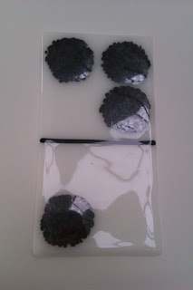
My glass experimentation also proved this as further experimentation was carried out in relation to the colours of black and white and of course transparency, but again I felt the white glass with the black frit was too similar to an ordinary domino, but quite liked the effect of the black domino with the black braille as it successfully merged the braille and the domino together aesthetically so that our eyes were not distracted by differing colours.
I feel that black is too harsh to use as a colour and doesn’t depict conformity in the way I am trying to contrive, and feel that returning to white could be an idea. I feel that white illustrates the lack of identity which happens as a result when our individuality is stripped from us when we choose to conform to fit in with others. I also feel that white has connotations of perfection as it is an unspoiled ‘pure’ colour, which depicts a society fuelled by instructions and obedience as we create a mould for society, one that is free of dissident entities that choose not to follow the norm.
          THE COLOUR WHITE
·         White is colour at its most complete and pure, the colour of perfection. The colour meaning of white is purity, innocence, wholeness and completion.
·         While there are very few negative connotations to white, particularly in western culture, too much white can be cold, isolating and empty. It implies a feeling of sterility, detachment and disinterest, providing little stimulation for the senses.
·         Too much white can cause feelings of isolation and emptiness; it can be too pristine and immaculate, making you feel as though you can't make a move for fear of upsetting it or creating a mess.
·         White is clean and clinical, giving an impression of efficiency and organization.
·         White suggests fairness and neutrality because of the balance and equality of all the colours contained within it.
 
          THE COLOUR BLACK
·         Black is the colour of the hidden, the secretive and the unknown, creating an air of mystery. It keeps things bottled up inside, hidden from the world.
·         Black is the absorption of all colour and the absence of light. Black hides, while white brings to light. What black covers, white uncovers. We all use black at various times to hide from the world around us in one way or another. Some of us use it to hide our weight; others among us use it to hide our feelings, our fears or our insecurities.
·         In colour psychology, black means power and control, hanging on to information and things rather than giving out to others.
·         Black implies self-control and discipline, independence and a strong will, and giving an impression of authority and power.
·         Too much black can cause depression and mood swings and create a negative environment. Combined with white only, it can create an argumentative atmosphere.
 
 
White will be representational of the loss of identity that comes as a result of conformity, by changing ourselves to fit in with others. Relevant research into the colour white states that it also conveys isolation and emptiness which expresses the feelings felt by someone who feels the pressure to conform, similar to the Emperor’s situation; they fear being an outcast therefore adapts to suit the company they are in. White is also an unspoiled colour, depicting a society overcome by conformity as everyone shares the same opinions and values with no real individuality existing and since white provides little stimulation towards our senses, this counteracts with the use of braille. Intuition in the sense of conformity is overruled when an ambiguous situation arises, therefore avoiding what we might already know just to follow the majority.

Making Moulds...

Since deciding not to continue with my glass experiments, I have now established that I want to create a mould in order to create my braille dominoes. This will be achieved by creating a former which will then be placed into the vacuum former resulting in the creation of a plastic mould which will then be filled with plaster.
 
As I have already stated, I aim to create a former which I will then place in the vacuum former which works by placing the former in the machine and lowering until the sheet of plastic on top has been heated enough for it to mould to the shape of the former. When this is achieved, the vacuum is then switched on and a mould is then left over within the plastic sheet which plaster can then be poured into.
 
As I want to use the vacuum former, a specific size can only be achieved, therefore the final piece will be a smaller scale version of what the piece could look like if the resources were available to me in a gallery setting. With this in mind, the measurements are:
 
Length – 46cm Width – 26cm Depth – 2.5cm
This then means that these are the measurements of the piece of wood which fits easily into the former and also leaves 1 inch gap all the way round.
To start with I found a spare piece of wood in the workroom and cut it to size using the bandsaw. I then got another strip of wood of the right width to use as the domino divider and again, cut to size and stuck on using the glue gun. I then began to stencil on to the piece of wood to establish where the braille dots would go, as well as estimate the ideal size of the braille dots to fit in with the size of the overall domino. Eight sections were stencilled on as explained previously to decipher where the braille dots would go as there are no more than 5 braille dots used in any letter in order to spell conform.


Success!!

Glass Experimentation

Since I have settled on the collaberation of two different ideas to represent conformity, I now need to think about how to create the braille dominoes and which subject matter will be best suited.

Within my sketchbook, i have created small experiments using plywood but since then, i have touched upon glass experiments and continued this experimentation outwith the confinements of my sketchbook. I investigated the conceptual relations with clear, white and black glass in a variety of sizes which steadily increased in size as development continued.
 
I want to portray a different side to the braille as so far the braille aspect has been prominent within the dominoes but with glass I wanted to capture texture in reflection to the short story, conformity is never mentioned or questioned but it is felt. The emperor and his associates cast a blind eye over what they know to be true and at the end of the story, the entire city follows the idea that the suit exists. By exploring braille more texturally rather than quite so prominently, it will allow me to discover whether this is an aspect I wish to take further and tone down the obviousness of the braille and make it less apparent.
The glass could also represent the vulnerability of the emperor, and how easily he was lulled into a false sense of security just by believing the words of the swindlers. Glass is also transparent, which could suggest that by using it to display conformity, illustrates the lack of substance we have when we all share the same opinions out of fear of being shunned.
 
Experimentation of Black Glass with Clear Powder


Experimentation with White Glass and Black Frit


Experimentation with Clear Glass and Black Frit


Evaluation of Glass Experimentation
Initially, I began by reflecting on the original aesthetics of a domino then focused on the inlaid pips and redeveloped them into braille to portray the message of conform. This fits in with the brief of the Emperor’s New Clothes as this overshadows the emperor in deciding to allow others to judge his new suit before him, to ensure it met the standards of others. The use of glass represents the fragility and vulnerability of the emperor and how easily he was lulled into a false sense of security just by believing the words of the swindlers. The transparency of the glass also suggests that by using it to display conformity illustrates the lack of substance we have when we all share the same values and opinions. Again, the lack of substance therefore reiterates the loss of identity as the braille dots are the focal point and create a contrast as individuality becomes lost due to the influence of conformity.
I firstly began by experimenting with black coloured glass to explore another side to the glass we experience in our day to day lives and as we are used to seeing glass as a transparent material, which relates to the emperor depicting power but in reality, he relies on the opinions of others. Although he may appear to be different from the rest of the town due to his powerful stance, we are all the same and often relate to others opinions before forming out own which then relates to the imitation effect of conformity. This then further relates to conformity in the way that we are manipulated into thinking a certain way due to the unwritten rules of society that are enforced upon us, much like the idea portrayed in my earlier research into Gary Deirmenjian#s work ‘Do Not’. The colour black also shows the ruthless reality of conformity by its dark and harsh appearance and portrays the idea of society being condemned to conformity.
After exploring black glass, it felt right to explore white glass as this happens to be t two main colours that dominos come in. As well as this, white signifies perfection as I’ve mentioned previously in other experimentation exploring white, as it is unspoiled and pure, which relates to the attitude of the government as they strive to achieve a mould for society. It also once again illustrates a lack of identity which also happens as a result of conformity. In relation to the textural aspect of the glass dominoes, I explored glass powder which failed to create the distinct braille effect and therefore I began to experiment with frit on bullseye glass which seemed to work better to achieve texture and heighten our senses. Although the frit looked better textually, the circles became extremely flat and this was due to the bullseye glass absorbing the frit more than an ordinary panel of glass normally would which results in a deeper fusion.
Bearing this in mind, I then finally decided to explore plain glass alongside the frit as I felt the frit created a better texture than the powder and felt that the transparent glass illustrates that by conforming to believe in something which was non existent, the emperor’s intuitions were ignored and consequently, resulted in him losing sight of his own identity and falling to majority influence which resulted in him demonstrating his vulnerability. I also felt that the transparency of the glass would heighten the braille infusion, allowing the instruction to create a deeper impact by illustrating that by conforming, identity is lost and all that remains is a shell of an ‘invisible suit.
All in all, I explored a range of sizes which developed from small to slightly larger in scale as well as a range of colours and techniques but felt that the braille and domino effect can’t be seen as easily as it may do with other materials which therefore requires further experimentation into materials. I feel as if I have thoroughly explored glass enough to decide to not carry it on any further in my development as it lacks conceptual relevance and therefore lacks enough connection for it to have enough potential to progress with. From this experimentation, I have also realised that I want to explore the braille side of things more exclusively and focus on the relation that the material has towards the concept as well as work larger in scale to create a stronger impact, displaying the effects of conformity on society