Monday, 5 December 2011

FLEX

Another Monday morning has arrived and another few maquettes have been produced in relation to the sculpture class. Although this class requires no conceptual development or attachment, I still find myself relating certain materials and ideas to the word at hand rather than experimenting freely with a wide variety of materials, so I decided to make a conscious effort to use materials that would be seen as being more frigid than flexible in todays class.


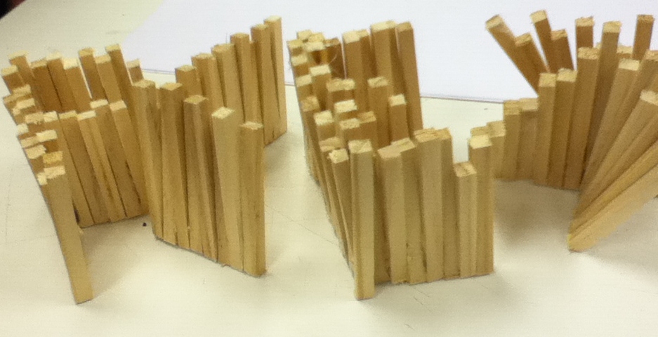


This was created by cutting varying lengths of strips of wood using the Bandsaw and gluing together in such a way that I recreated and developed from the pixelated style that I created for the letter 'X' in an earlier experiment. I done this by gluing the ends then edging out the tops of each strip to create this effect which i find works well and could be developed further into a final piece by using larger strips of wood alongside wood glue to create this at a larger scale. I particularly like the way it is consistantly interesting from all angles which is essential to any 3D work. From this, I decided to experiment one step further by using the vacuum extractor for one of the letters just to see the outcome and determine whether or not any potential could evolve from this technique.


Due to the height of the lettering, this technique was always going to be done at a chance as the plastic needs to be blown up before being vacuumed in order for the height to be extracted. Although this experiment didn't turn out particularly well, I like the graffiti style it has created as the plastic has been strained at each corner of the lettering nonetheless creating an interesting look.

In addition to this, i decided to experiment with Styrofoam and cut out block lettering with precision and accuracy using the bandsaw to achieve a very defined style, once again a material that i wouldnt instinctively associate with the word 'FLEX'.


Composition wise, I played around with varying styles but for this one shown above, i tried to recreate a regimented look as well as maintaing a disarranged manner by lowing certain letters. I think that by using such simple lettering like this composition would be essential to providing an intriguing 3D artwork. For the next composition i wanted to move away from a 'controlled' aesthetic in order to create a scattered arrangement.


I quite like the look of this maquette, but decided to adapt it further by cutting down the height of the 'L' and 'X' to create a deranged effect from the varying heights.


After i had cut down the size of both letters i reverted back to a rigid composition which highlights the variation of the size in lettering but for experimental purposes decided to look into the scattered effect again now that adaptions had been made in relation to the lettering.


I find that this works well, and think if there was a stack of random styrofoam shapes underneath this maquette it could have potential as a final composition as i feel anything other than sharp shapes would be too diverse for it to look visually pleasing.

More Experiments to come alongside final piece!

Thursday, 1 December 2011

Additonally...

In other news, I have also been undergoing a sculpture class as part of the 8 week tutorial sessions which was previously video.
In this class, I was given the task of choosing a word and then manipulating and producing maquettes and of course a final piece of the chosen word at hand.

I decided to choose the word Flex as it instinctively stood out for me and gave me the most ideas in terms of materials and a final outcome.


In the above maquette I manipulated wire using a mixture of straight and curvacious formations in order to create a disorderly effect where the viewer has to carefully seek out the lettering.


From another viewpoint.


For the second maquette I decided to use mainly wood with wire to create a simple but effective distinctive style for each letter. The 'F' was created by breaking up wooden sticks and simply rearranging them together again in a disarranged manner using the glue gun. The 'L' was made by using sheets of soft wood to create a a linear form. For the 'E' I decided to use wire to add to the combination of wood and simply reformed the wire using curves to create the simple lettering. Finally, for the 'X' I decided to use wooden blocks and glue then together in a pixellated manner to again add to the effect of a wide range of text styles. Personally, I find that this one works quite well and has a quirky appeal.


Close up of 'FL'


Close up of 'EX'


Created a simple experiment using card to create simple shapely form. The pieces of card were then glued down to hold into place and pictured from different angles. For this experiment I only looked at the letters of L and E and didn't find the aesthetics to be upto standard and dismissed this idea as I didn't feel it had as much potential as the others so far in terms of manipulation.


Birds eye view.


Another experiment created using wire then wrapped in string to create a natural loose formation. I particularly like the style of the lettering as I tried to incorporate my own handwriting as it tends to have flexible tendancies in terms of the F and L lettering. I think that the font adds to the piece and the string creates an interesting effect. This one is a possibility to be taken further as I find their to be potential at a larger scale.


More pictures will be following soon of more experimental ideas and maquettes!

A See-Through Perspective...

Since my last post, I have moved on a great deal and now have a concept which will more than likely change once the final piece has been made and reflected upon.

Statement of Intent-
From looking at the Alloa campus, I was automatically drawn to the vast amount of glass used in the building creating a very contemporary look as well as giving off the appeal of a blank canvas. Bearing this in mind I wanted to add subtle colour and add to the original features of the building while also looking into the towns past. As I explored into Alloa’s history, I found out that the area was well known for glass making which again fits in well with the route I was beginning to consider.
Relating to the idea of using glass, brought me onto the thought of it representing opportunities as unlike mirrors, glass enables the viewer to shift between looking at it, and looking through it, similar to the mentality of someone focusing on their future potential by studying at the college. Glass as a material can symbolise the formation of realisations that students go through whilst they adapt to further learning, by allowing a clear image of their aspirations to be ‘seen’.
I want to use glass as a building technique and create the appeal of something being fragile, taking a stance and representing a dense structure within the campus. I want the piece to merge in with original features and imitate its surroundings just as glass reflects what is before it. In addition to this, I want the piece to represent the steps that are being taken as Alloa as a town, and the students that attend the campus to expanding themselves and by using and manipulating glass, I believe an artwork could be constructed which signifies the past, and of course is notable for the campus' future and the students who are furthering themselves within it.
Fundamentally, I want to create a glass structure which epitomises potential and prospects for the area and the students to relate to. I want to signify that a structure can be created which idolises fragility, but on closer inspection denotes a formation. The idea of focusing on the potential and prospects which have been created through the opening of the new campus will create an uplifting and inspirational piece that will hopefully compliment the themes that are carried on throughout the building.

Moving On...
After deciding to use glass as my starting point in relation to my concept, I decided to move forward by creating 'glass bricks' more in the sense of pattern and size rather than creating 3D objects. I felt that the idea of a brick pattern was well suited towards the idea I am trying to portray with relation to breaking barriers for Alloa and everything that this new campus stands. In addition to this, the idea of a brick wall coming before us in our learning environment, can be seen as being  defeated and conquered as well as seen through by the decision to use glass to create this effect. I felt that this would be an inspirational subject matter as well as aesthetically pleasing.
So far, I decided to experiment with two completely different approaches, one using glass stringers and the other with a broken glass effect.
Here are some pictures of both;


 After I had make two very different experimental glassworks, when seeking to find new ideas I placed one on top of the other, and found the outcome to be very interesting with a lot of potential. The combination of both fulfilled the need for colour and also a broken glass effect and found it to be visually effective as well as suitable to my concept.

The Combination...


Thursday, 3 November 2011

New Campus; New Art; New Brief!

Since the hand in of the last brief, we have now moved onto a new brief which asks us to produce an artwork of any kind for the new Alloa campus. Personally, I find the fact that the artwork will be displayed outwith the creative industries department of our own campus exciting! Stepping out and exploring different surroundings is always inspiring, especially one with such a blank canvas like Alloa.
We went and visited the new campus on a monday afternoon to take pictures for research purposes and for our first look for ideas towards the brief. What I recognised in the campus was the fact that everything is very white, with a hint of the outdoors with bold wood structures like the staircase;


I particularly like the geometric shape of the staircase, which is carried on throughout the building a lot like many other features as linear forms seem to exist almost everywhere you look with very little curves in the building apart from the lighting. Colour is also lacking in the campus, and in reaction to this I took a picture of the only colourful aspect of the campus:


The bold seating is eye catching as it is colourful and curvaceous, a complete contrast to the rest of the entire building. My first thoughts were to add colour to the building somewhere for others to appreciate and notice. One thing I do not want to do is dominate the building with my art, I simply want to construct something with colour so that at any scale, it will be noticable and appreciated. I also managed to capture a picture of artificial colour and curves, which I found motivating as this was done from the reflections of the ordinary lighting onto the camera lens creating a stunning image:


This just illustrates that colour is meant to be found in the building, we just need to enhance and explore original features of the building and of course its surroundings. Finally, my current thoughts are bringing me onto the theme of reflections in the form of reflecting on the surroundings of the campus and the areas past, which lead me onto the findings of the glassmaking industry which thrived in alloa and is well known for. I want to create something which signifies the past, and of course is notable for the campus' future and the students who are furthering themselves within in. This is only the beginning of the project so indefinitely the concept will change and adapt and hopefully provide me with a strong basis for my final submission.

Sunday, 16 October 2011

Done and Dusted!

Well, the brief of 'Where are we from? What are we? Where are we going?' is officially over with! I am happy with what I produced and presented on Thursday 13th of October, and for the first time my final piece was ready days in advance!
I hope that through my artist's statement, I have explained that although the final installation piece itself is simplistic in nature, the meaning and concept behind its creation is one with an in-depth meaning.
Here are some pictures of the final piece with some students engaging with the artwork followed by my artist's statement.
'My Life, My Time'


Artists Statement

The piece is a direct response to the brief of ‘Where are we from?’ ‘What are we?’ ‘Where are we going?’ by concentrating on the separation that exists within time, through identification of our prior self, and the prospect of ourselves in the future, and preserving what we are due to the apprehension of what we could become. Through time we change and our life changes and therefore our state of mind is almost relevant to which time we are at in our lives.
Through this installation, I am representing myself, and how I have developed over time. The installation is a direct projection of myself through numbers, as each number is symbolic of each moment I have lived in my life. 599184000 is how many seconds there are in 19 years, 9986400 is how many minutes, 166440 is how many hours, 6935 is how many days, 990.714 is how many weeks and 228 is how many months there are which all make up my 19 years of life. This illustrates that every number is a documentation of where I came from, the present moment and the prospect of there being another second, and another minute which will make up my life over time. 
599184000 9986400 166440 6935 990 714 228=19
The repetition of the tiny numbers creates the deception of every number being insignificant, whereas this is not the case. Each number is miniscule for the viewer to realise that although there are many seconds which make up a life time, not every moment is appreciated, and loses value over time just as anything repeated begins to decline in importance. If the viewer decides to look closer, then this signifies that in life some people choose to follow time, whereas others decide to ignore it. The magnifying glass epitomises the choice that exists within time by either appreciating it, or merely existing in time and highlights each moment that exists within my life. It could also be seen as a surveillance tool used to focus in on every moment in my life, so far.
The ticking clock exemplifies that although I have preserved this moment in my life, each second that passes is another moment obtained into my future. The sound can only be heard, and the question of where it is coming from is irrelevant, as time is a constant continuation that is not tangible, but the effects of it can be seen all around us, and this is why the installation is 2D.
The grid like composition is a direct make up of myself as there are 19 lines in each grid which is representational of my age, and the grids make up my height of 62 inches in this stage of my life. This symbolises that even though I might not look like a part of the piece, there will always be a constant connection with myself within it as the whole piece is a conceptual projection of me over time.
This space was directly chosen as it is a wall which is easily seen, yet many people walk past and never really observe. As I have mentioned, it is down to personal preference to follow time, or ignore it just like this space. It is there, and is a vital foundation to our building yet many other factors help support the structure. Just like this small structure, I have many more years to live, but the first short 19 years of my life have taught me to be the person I am, and will be a part of the foundations to my future.
Fundamentally, this installation is made up of observations, identification and time which again reflects onto where I came from, What I am presently, and the prospect of what might happen over time. If the viewer takes the time to appreciate the finer details of the piece, they will realise that the numbers are only just the beginning...


Monday, 10 October 2011

Busy, Busy, Busy!

Well, I am guilty of neglecting my blog for the past few weeks as I've been so busy with my Creative Practice project along with my Video Class.. So here is an update on both;

Creative Practice- I have moved on a lot since my last post as I have now *nearly* finished my final piece! In my initial PLP I described that I would dissect clocks in order to represent time and how time is the essence of us, and more importantly, me. I have chosen to look at the brief of 'Where are we from? What are we? Where are we going?' at a more personal level, and in doing this I looked into different ways of representing time, which made me think of numbers. By looking at numbers, I am still following what I stated in the PLP as numbers make up time, which makes up our past, present and future. In doing this, I want to create a final piece which illustrates my time in a less obvious manner and intrigues the viewer to look closer and appreciate the time we have had, and the time still to come. I looked into how many seconds, minutes, hours, days, weeks, months and years make up my life, of 19 years. I took this information and created my own equation of numbers which represent my time so far:
599184000.9986400.166440.6935.990.714.228=19
In order to relate this more to myself, I decided to make the text size 5, making it extremely difficult for the viewer to read unless they are up close and then repeat this 19 times into a block/grid style. By doing this, I want the viewer to come closer to the piece, and realise and appreciate the time that has went into the piece by hand writing every single number onto the wall selected, as well as appreciate the time we all have on this earth. Some people choose to ignore time and and not let it restrict their life, while others follow time, and plan accordingly which the viewers can do with this piece; ignore it or appreciate it. Whatever they decide, the piece will still exist as an exact representation of myself at this moment 'in time'.
Here are some pictures of the piece in progress...


A lot of time and dedication has been spent on this project along with precision and accuracy, which I hope shows in the piece on presentation day and justifies the concept and brief to its fullest potential. 

Video Class- I haven't mentioned that I have an ongoing video class every monday morning which, if im being honest, wasn't looking forward to at the start of the term, but after roughly 7/8 weeks of the class, I have really enjoyed it and found myself considering using video in one of my next projects. I have learned a lot, and appreciate video art more now as I understand how the basics work,and the time and effort required along with an imaginative persona. We were asked to produce a 1 minute video in response to a theme of our choice, and I chose to look into lights and how they guide us through life and create journeys. As of today, I have passed the class and managed to produce 2 minutes of video footage which I have edited and altered to justify my theme by tampering with black and white effects, backing tacks and other editing tools which I named ' Lights of Guidance'.

Hope to upload pictures of the final piece for Creatice Practice next week!